

Steve Anaka
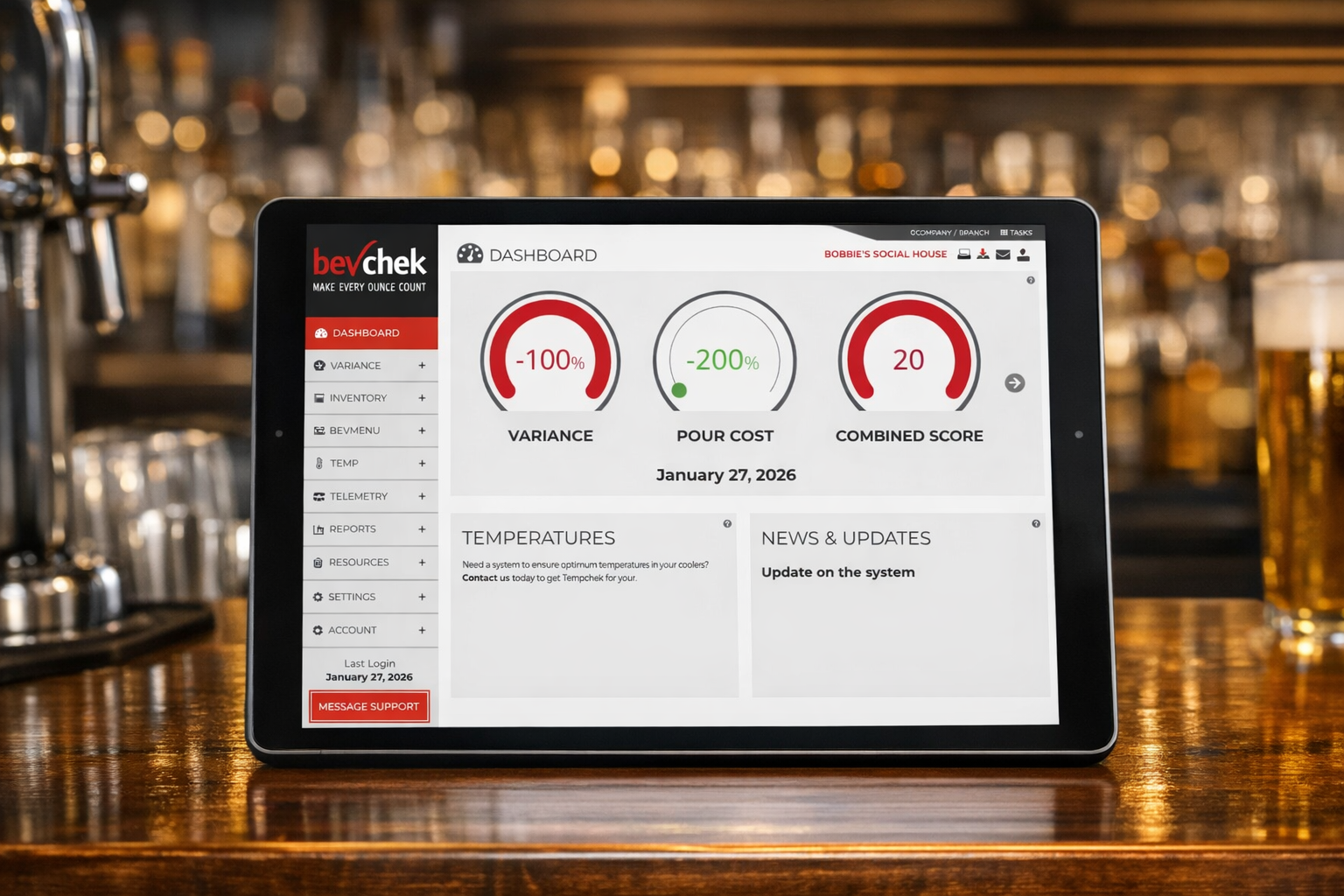
If your draft analytics stop at total pours, you’re not measuring what actually drives margin.
Total pours is a headline number. It tells you volume moved, not why a keg came up short, not which line is bleeding product, not whether last Tuesday’s “shortage” was theft, foam, or a bad regulator. Most dashboards stop at the surface because that’s what’s easy to pull from a POS. Real draft beer analytics go deeper — down to the line, the pour, the degree, the psi.
Here are the seven metrics that actually tell you what’s happening in your draft system, and why each one earns its place on a real analytics dashboard.
1. Pour Volume by Line
Not total kegs sold — volume per individual line, tracked continuously. Aggregate numbers hide the problem. A venue can look fine on paper while one specific line is quietly overpouring or underperforming every single day. Line-level volume is the base layer every other metric builds on.
2. Pour Variance
The gap between what should have been poured (based on recipe or standard serving size) and what was actually poured. This is the number that turns “we’re missing product” into “we’re overpouring by an average of 0.4 oz per pint on Line 2.” Variance is where margin actually leaks, and it’s invisible without line-level tracking.
3. Temperature Performance
Beer poured outside its optimal range foams more, wastes more, and tastes worse. Temperature isn’t a quality metric that lives separately from loss — it’s a leading indicator of it. A line running warm today is a foam and waste problem tomorrow, and tracking it continuously catches the drift before it shows up in a keg count.
4. CO₂/Gas Pressure
Inconsistent gas pressure is one of the most common — and most overlooked — causes of pour inconsistency. Too high or too low, and you get foam, flat beer, or wasted product on every single pour until someone notices. Pressure should be monitored the same way temperature is: continuously, not checked manually on a schedule.
5. Line Activity and Idle Time
How often a line is actually pouring versus sitting idle matters for both freshness and planning. A line with long idle stretches is a spoilage risk. A line that never stops is a candidate for a bigger keg or a second tap. Activity data turns “which beer sells” into “which beer sells fast enough to stay fresh on this system.”
6. Equipment Health Indicators
Regulators, couplers, and lines degrade gradually, not all at once. A coupler that’s slowly failing doesn’t announce itself — it shows up as small, creeping variance that looks like waste until someone finally inspects the hardware. Equipment health metrics (drawn from the same pressure, temperature, and flow data) flag wear before it becomes a bigger repair or a bigger loss.
7. Variance-to-Cause Attribution
The most advanced — and most valuable — metric isn’t a single number. It’s the ability to explain a variance instead of just reporting it: was this pour loss, spoilage, a miscount, or a mechanical fault? Most systems can tell you that a keg came up short. Attribution tells you why, which is the difference between a monthly mystery and a two-minute fix.
Why This Matters More at Scale
For a single bar, these seven metrics mean faster answers and tighter margins. For a multi-location group, they mean something bigger: a common standard for what “performing well” actually looks like, applied consistently across every site. Without that standard, comparing locations is just comparing gut feelings. With it, underperformance shows up in the data before it shows up in a P&L.
Measure What Actually Moves Margin
Bevchek was built around these seven metrics — not vanity dashboards, not total-pour counts, but the line-level data that actually explains where product, quality, and profit are being won or lost.
Want to see what your draft system’s real numbers look like? Schedule a demo.